[Scroll]
naila - the artisanal affair
WHY
AND HOW
[1]
PROBLEM
Coffee branding typically relies on muted minimalism, often blending into a "sea of sameness." Naila, a startup bridging India and Japan, needed to disrupt this norm with an energetic identity that communicated high impact and cultural vibrancy without sacrificing brand clarity.
[2]
SOLUTION
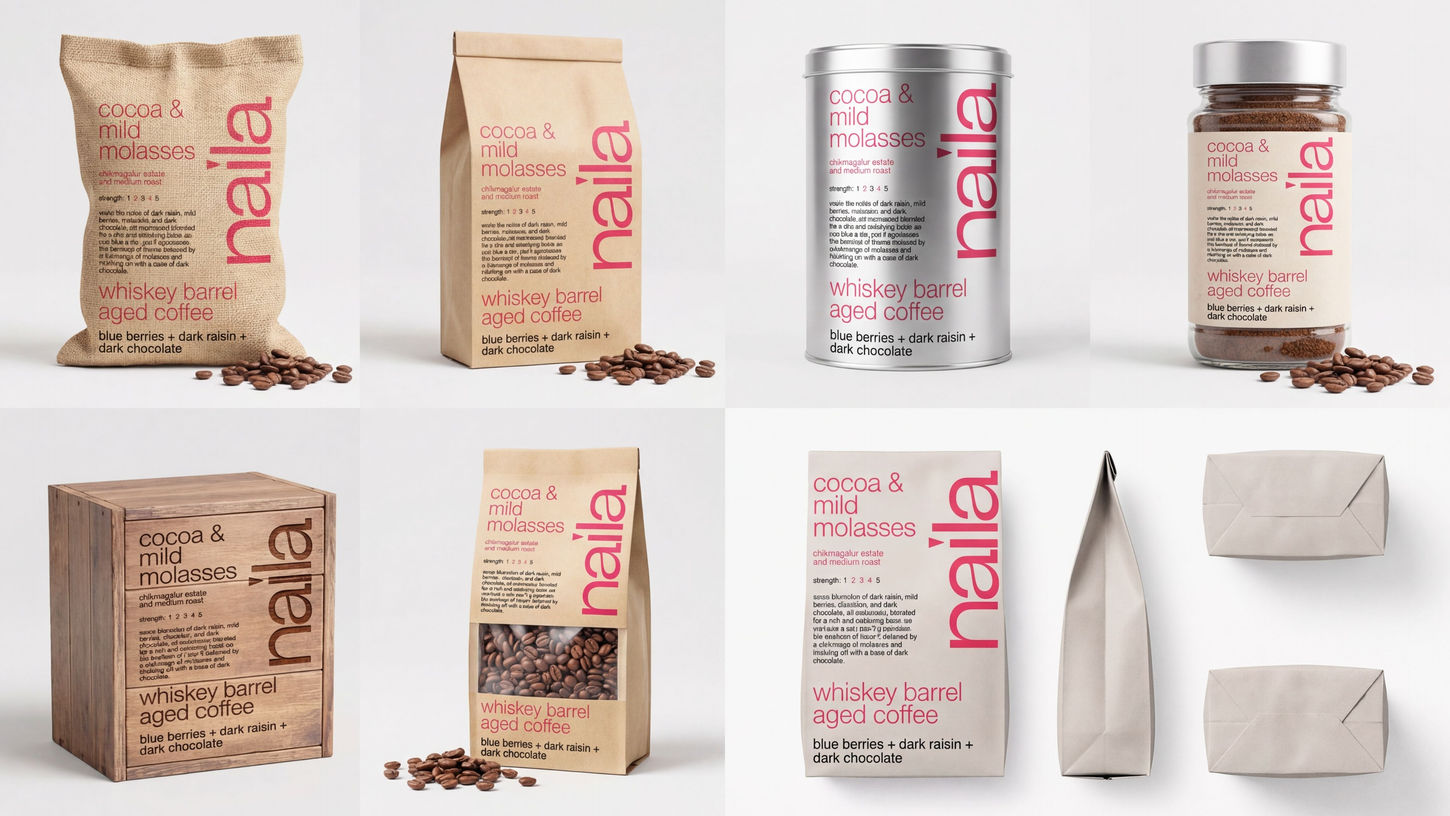
We engineered a dynamic system featuring 150+ colorways and 10+ typefaces to maximize expression. By anchoring this variety within a consistent "parent" design structure, the final identity is unapologetically colorful and energetic, yet remains structurally simple and instantly recognizable.

Naila is a startup brand meticulously designed for an investor pitch, built to disrupt its target market through a unique and powerful focus on visual distinctiveness. Our core objective was to create a brand that feels premium and sophisticated while remaining highly accessible to a broad demographic aged 18-45.
The essence of Naila's design lies in its strategic use of color and text as the main highlights. We embarked on an exhaustive design process, exploring over 150 unique colorways to ensure every single product variant has an inherent ability to "stand out from the shelf." This is not merely an aesthetic choice; it's a deliberate, data-driven approach to capture consumer attention and achieve market differentiation.


