[Scroll]
kaps - brews and clothes
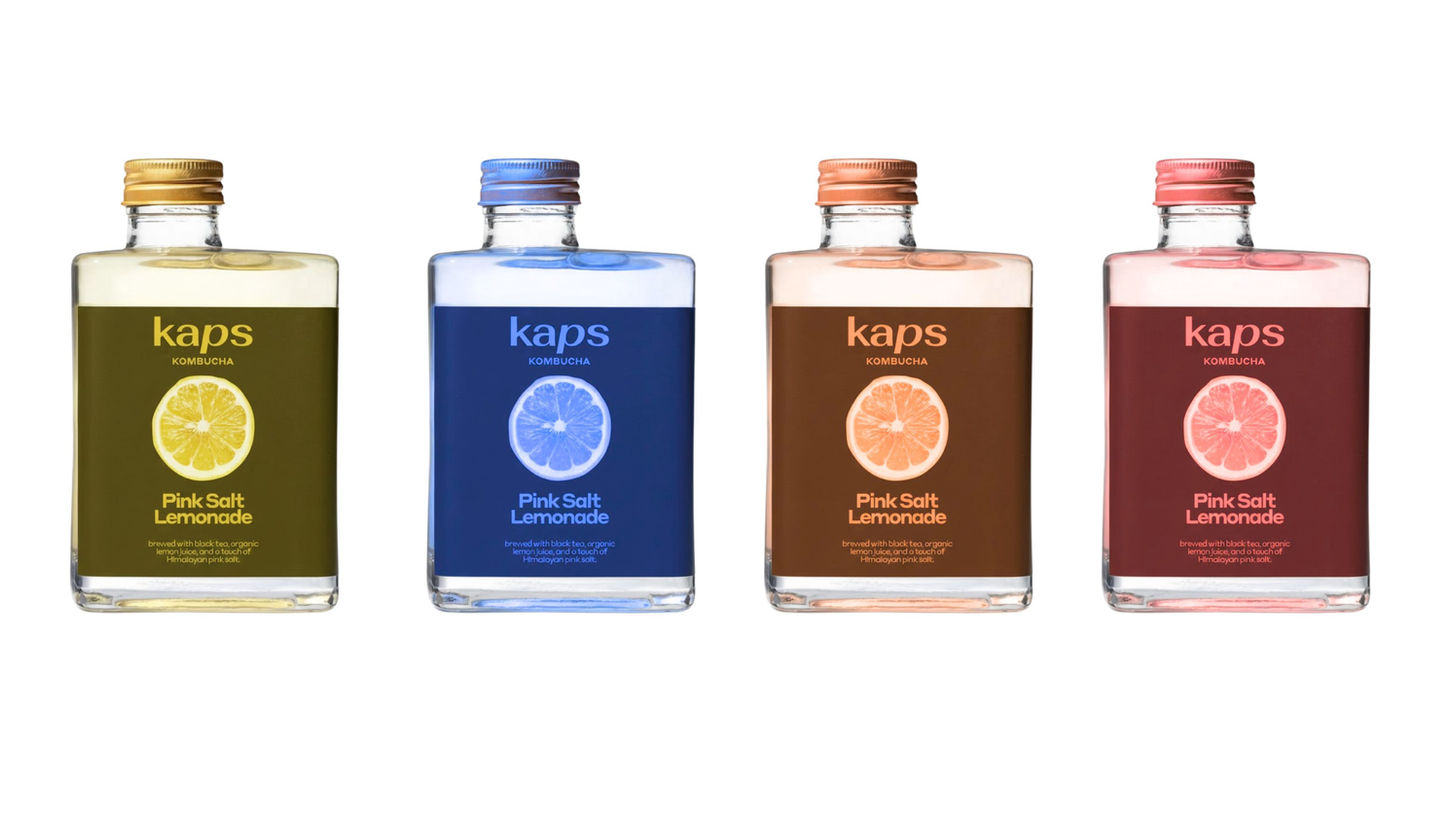
branding + label design
Kaps defines its brand through a marriage of sensory experiences rooted in the California coast: a beverage line and an apparel collection, both united by a distinct matte, dusky color palette. This aesthetic rejects loud, saturated tones for sophisticated, sun-faded hues like terracotta, sage, and soft beige, speaking directly to the discerning "girlie" seeking understated cool. The beverage offers a premium, perhaps lightly flavored or functional, refreshment that aligns visually with the clothing—think packaging that looks like a smooth, sea-worn stone. This consistency creates an instantly recognizable lifestyle mood that is effortlessly chic and deeply connected to coastal living.
WHY
AND HOW
[1]
PROBLEM
We begin by immersing ourselves in knowledge gathering exploring context, audience, and challenges. This is where we form our initial design thinking, moving past assumptions to define the landscape of the project. The result is a robust understanding that makes all subsequent decisions intentional.
[2]
SOLUTION
Designed entirely from the knowledge gained during Research, the Strategy phase is where we distill complex findings into a clear, unified design position. This critical step defines what we will create and why it will be effective, giving the creative team a definitive roadmap and mandate for success.


