[Scroll]
98 percent - pure cocoa
Branding + Packaging + Social Media + Investor Strategy
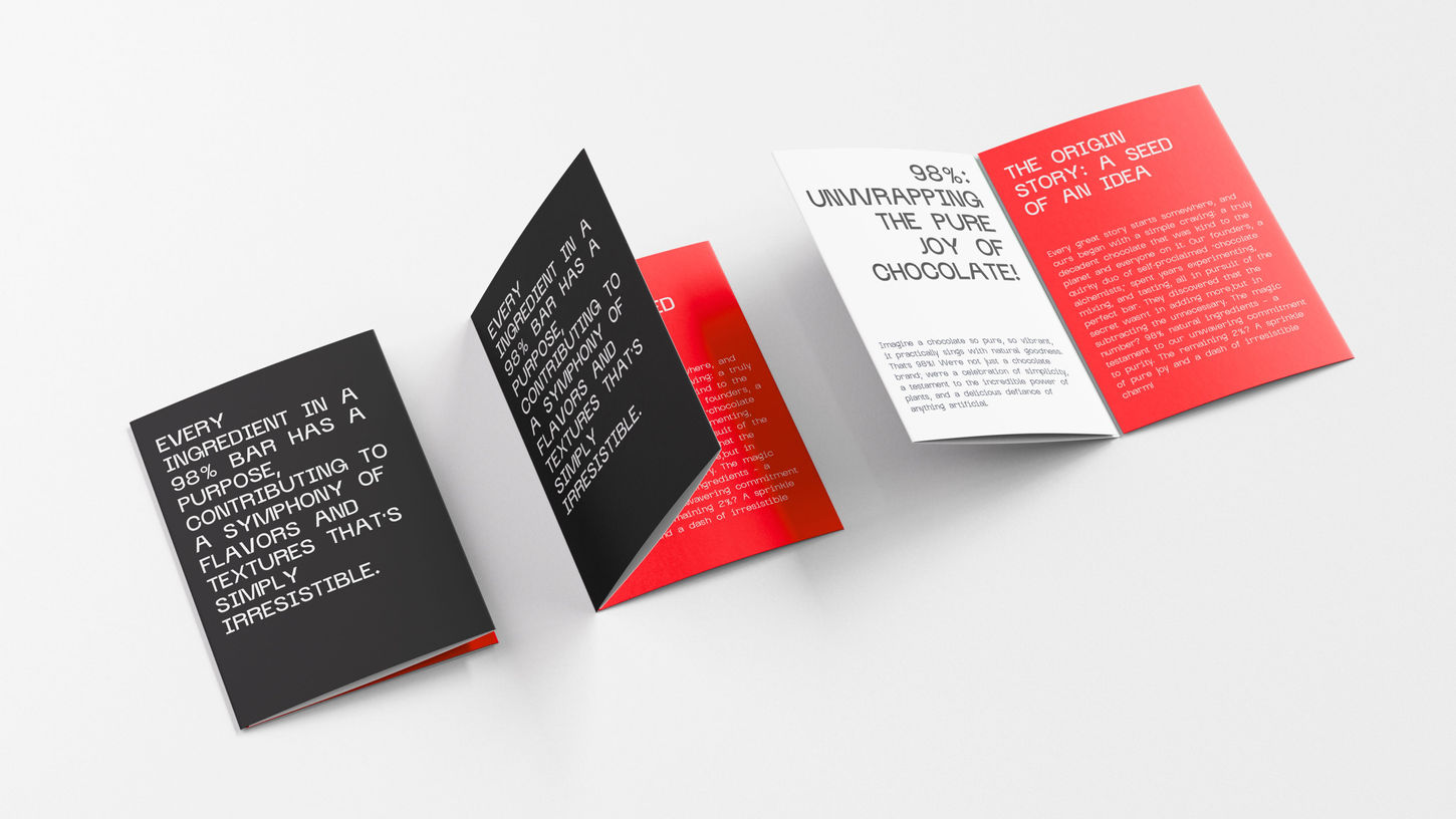
Our core focus is on creating chocolates that are not only delicious but genuinely beneficial, moving away from the conventional guilt associated with sweets. The brand name, 98%, serves as a direct and bold statement of our commitment to a high percentage of healthy, pure ingredients. A key differentiator for 98% is our innovative design-centric approach to sales. We believe that the visual appeal of our products is as crucial as their taste and health benefits. This translates into thoughtfully designed packaging where the "98%" text is the undeniable highlight, prominently featured and integrated with a color palette specifically chosen to reflect and enhance each unique flavor.
WHY
AND HOW
[1]
PROBLEM
The chocolate and sweets category is heavily associated with guilt, excessive sugar, and low nutritional value. Even when healthier alternatives exist, they often fail to communicate their benefits clearly or attractively. Most brands rely on generic packaging and messaging, making it difficult for consumers to instantly understand what sets the product apart. There is also a gap between health focused products and strong visual branding, resulting in offerings that may be good for the body but uninspiring on the shelf. As 98% looks to move beyond the Mumbai market, the challenge is not only to stand out in a crowded category but to build immediate trust, clarity, and desire across diverse Indian cities.
[2]
SOLUTION
98% addresses this gap by redefining chocolates as both indulgent and genuinely beneficial. The brand name itself acts as a bold, transparent promise, clearly communicating a high percentage of pure and healthy ingredients. A strong design led approach becomes a key differentiator, where packaging is treated as a primary sales and communication tool. The bold “98%” mark takes center stage, supported by carefully curated color palettes that reflect and enhance each flavour, making the product instantly recognisable and appealing. This visual strategy captures attention, conveys the brand’s values at a glance, and resonates with a conscious, design aware consumer. Through this project, 98% is positioned to scale beyond Mumbai into larger cities across India, establishing itself as a young, innovative brand with strong visual identity and credibility in the healthy snacking space.


