[Scroll]
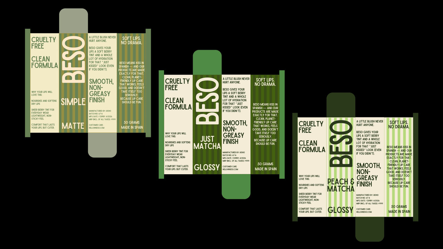
For BESO, we developed a confident and expressive packaging system that places personality on equal footing with performance. The visual language is intentionally bold, using high contrast colour combinations, rhythmic vertical stripes, and playful flavour naming to create immediate recognition and recall.
Oversized, clean typography delivers strong shelf presence, while repeated brand phrases such as “Soft lips. No drama.” and “Glossy” act as consistent anchors across the range. Each variant is designed to balance energy with structure, ensuring the packs feel vibrant without becoming chaotic. The result positions BESO as a contemporary lip care brand that is self aware, playful, and clear about its audience, combining premium intent with a sense of fun.
WHY
AND HOW
[1]
PROBLEM
The lip care aisle is overcrowded with products that either feel overly clinical or rely on generic “cute” aesthetics, making it difficult for new brands to stand out. Many lip tints look interchangeable on shelf, lack a strong voice, and fail to emotionally connect with a younger, expressive audience that values both performance and personality. As a result, discovery is low, memorability is weak, and brand loyalty is hard to build.
[2]
SOLUTION
BESO’s packaging system was designed to cut through visual noise with confident colour, bold typography, and playful language that instantly communicates attitude. By pairing a consistent graphic structure with expressive flavour names and punchy copy, the design creates high recall and strong shelf presence while remaining clear and premium. The result is a distinctive, scalable identity that makes lip care feel fun, relatable, and self-assured — turning a functional product into a bold personal statement.


